A florist once shared a simple observation: customers can sense when an arrangement feels “right,” even if they cannot explain why.
A bouquet of tulips in early spring feels natural and uplifting. The same tulips in late autumn feel slightly misplaced. The difference is not technical skill. It is seasonality.
Designing with seasonal flowers is not a nostalgic preference. It is a structural principle that strengthens authenticity, texture, and emotional resonance. When floral materials align with the time of year, they carry visual cues that our senses instinctively recognize.
Spring: Fresh Growth and Light Structure
Spring flowers emerge from dormancy. Their stems are tender, colors are luminous, and forms often lean toward delicate curves.
1. Embrace airy spacing
Spring materials such as tulips, ranunculus, and sweet peas have flexible stems and soft silhouettes. They benefit from open compositions with visible negative space. Overcrowding diminishes their natural grace.
2. Highlight vertical movement
Many spring branches—like cherry blossom or flowering quince—feature upward lines and budding nodes. Allow these branches to extend beyond the main mass, reinforcing the sense of growth.
3. Use a restrained palette
Spring color ranges often include pale pinks, fresh greens, and buttery yellows. Limiting the palette to two or three hues preserves clarity and reflects the subtle transitions seen outdoors.
Spring arrangements succeed when they feel light in weight and optimistic in tone.
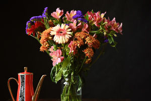
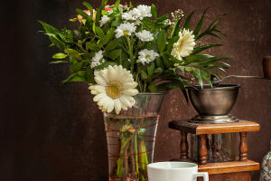
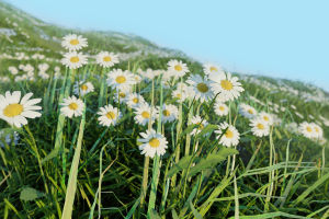
Summer: Abundance and Saturation
Summer introduces volume. Gardens reach peak bloom, and flowers develop richer pigmentation under longer daylight hours.
1. Layer generous focal blooms
Dahlias, and garden roses offer full heads with layered petals. These flowers can support denser compositions because their structure withstands visual competition.
2. Incorporate textural contrast
Pair rounded blooms with spiky elements such as delphinium or grasses. The interplay between smooth and linear forms prevents heaviness.
3. Work with bold color transitions
Summer palettes often include coral, magenta, deep blue, and bright orange. Instead of scattering colors randomly, cluster similar hues together to create intentional color blocks.
The goal in summer is controlled abundance. Fullness should feel energetic, not chaotic.
Autumn: Depth and Earth Tones
Autumn materials introduce weight—both visually and physically. Stems thicken, foliage darkens, and textures become more pronounced.
1. Focus on tonal layering
Autumn palettes lean toward rust, burgundy, mustard, and muted greens. Arrangements become more sophisticated when these tones blend gradually rather than contrast sharply.
2. Add structural foliage
Branches with turning leaves or seed pods provide architectural support. Their irregular shapes introduce movement while maintaining seasonal authenticity.
3. Allow asymmetry
Autumn landscapes rarely appear perfectly balanced. Slight asymmetry in floral design reflects this organic shift and enhances realism.
At this time of year, density is acceptable, but negative space should still frame the overall silhouette.
Winter: Minimalism and Line
Winter demands restraint. Fewer blooms are naturally available in many regions, and structural elements take precedence.
1. Emphasize branches and evergreen textures
Bare branches, pine, and cedar introduce linear clarity. Their firmness anchors arrangements visually.
2. Limit bloom count
Amaryllis or hellebores, often available in winter months, carry strong sculptural presence. A small number placed with intention often proves more impactful than a crowded display.
3. Highlight contrast
Winter arrangements benefit from contrast between dark greenery and pale blossoms, or between matte foliage and glossy berries.
Simplicity in winter feels deliberate rather than sparse.
Seasonal design is not about strict rules; it is about observation. When flowers echo what is happening outdoors—the tender optimism of spring, the intensity of summer, the maturity of autumn, the clarity of winter—arrangements feel grounded rather than artificial.
The next time you select flowers, look beyond color alone. Consider how the stems bend, how the petals hold light, how the textures shift with temperature. Aligning with the season does more than improve aesthetics. It reconnects floral design to the living cycle that gives it meaning.