You're standing in front of buckets of flowers, and suddenly every color feels too loud.
Pink looks sweet alone but strange next to yellow. Purple feels rich until it sits beside white and suddenly looks dull.
This is where many people freeze. Color in floral design feels intimidating because we think it's about rules. It's not. It's about narrowing choices until your eyes can relax.
Start with one color you already like
Comfort, Confidence, Direction
The easiest way to avoid overwhelm is to begin with a color you're naturally drawn to. Personal preference matters more than trends.
1. Choose one main color you enjoy seeing in your home.
2. Ignore other colors at first, even if they look tempting.
3. Build the arrangement around this single choice.
Actionable example: If you love soft purple, choose purple flowers first and place them alone in a container. This helps you see their tone clearly before adding anything else.
Work within one color family
Harmony, Flow, Ease
Colors feel calmer when they're closely related. Staying within one family creates an instant sense of order.
1. Use light, medium, and slightly deeper versions of the same color.
2. Avoid jumping across the color spectrum.
3. Let subtle variation replace contrast.
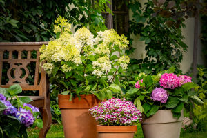
Actionable example: Combine pale pink, dusty rose, and soft blush flowers together. Even with different flower types, the arrangement feels natural and connected.
Use green as a neutral anchor
Balance, Breathing room, Stability
Green is the quiet hero of floral color design. It gives the eye a place to rest.
1. Add greenery between clusters of color.
2. Use it to separate similar shades that feel too close.
3. Let green frame the overall shape.
Actionable example: If your flowers feel too intense, add a few leafy stems around the edges. The colors instantly feel calmer and more intentional.
Limit your palette to three colors
Clarity, Focus, Control
More colors don't equal more beauty. They often create confusion instead.
1. Choose one main color.
2. Add one supporting color that's nearby in tone.
3. Use green or white as the third element.
Actionable example: Build an arrangement using white flowers, soft yellow accents, and green foliage. It feels fresh without being busy.
Pay attention to light, not just color
Depth, Contrast, Interest
Two flowers can share the same color but still clash because of lightness.
1. Notice whether a color looks pale, medium, or deep.
2. Mix light and medium tones before adding dark ones.
3. Avoid using only deep shades, which can feel heavy.
Actionable example: If all your flowers are dark purple, add one lighter lavender bloom to lift the whole arrangement.
Repeat colors instead of spreading them evenly
Rhythm, Unity, Polish
Color feels intentional when it shows up more than once.
1. Place the same color in at least three spots.
2. Avoid grouping all of one color together.
3. Let repetition guide the eye around the arrangement.
Actionable example: If you add a yellow flower near the top, place another lower down and one slightly off to the side. The arrangement feels connected instead of random.
Trust soft contrast over strong contrast
Calmness, Approachability, Ease
High contrast can be striking, but it's harder to control.
1. Use gentle contrasts like cream and pale peach.
2. Avoid pairing colors that fight for attention.
3. Let shape create interest instead of sharp color jumps.
Actionable example: Pair soft blue flowers with white instead of bright yellow. The result feels relaxed and balanced.
Step back and adjust slowly
Perspective, Awareness, Confidence
Color decisions make more sense from a distance.
1. Arrange flowers, then step back a few feet.
2. Look for areas that feel too heavy or too empty.
3. Adjust one stem at a time instead of redoing everything.
Actionable example: If one color dominates, remove a single stem and see how the balance changes before making bigger moves.
Color in floral design doesn't need to feel like a test you can fail. When you simplify your choices, your instincts become clearer. Flowers already know how to look good together. Your job is just to quiet the noise, give them space, and let their colors speak naturally.