When you look at a design that feels alive—whether it's a website, a room layout, or even a piece of artwork—there's often an unspoken flow. This "flow" gives the design an organic rhythm, almost as if it's moving.
So, how do designers create that sense of movement? It's all about manipulating visual elements to guide the viewer's eye, create a natural progression, and evoke emotion.
Here's a closer look at how to achieve that dynamic feeling in design
What Is Flow in Design?
Flow in design is all about creating a sense of movement within a static visual. It's how your eye travels across a page or object, connecting different elements in a harmonious and intuitive way.
Good flow doesn't just happen randomly—it's strategically planned by designers to direct attention and create a visual experience that feels natural.
Think about a well-organized magazine layout: the flow leads your eye from one article to the next, with each page working together in an organized manner. Without flow, the design could feel disjointed and hard to follow.
Key Elements That Create Flow
There are several tools and techniques that designers use to build a strong sense of flow:
1. Line Direction
Lines are one of the most straightforward ways to guide the viewer's eye. They can lead your attention from one part of the design to another, creating a pathway that feels intentional. In graphic design, lines can be literal (like arrows) or implied (like the edges of a shape or objects aligned in a specific direction).
For example, a website's navigation bar often leads you to the most important sections, guiding your journey through the site. By using subtle line directions, designers can make sure you don't get lost.
2. Contrast and Proximity
Contrast in color, size, or shape naturally draws attention and creates focal points within a design. By strategically placing contrasting elements next to each other, you create a sense of movement as the viewer's eye jumps between different features.
For example, a large, bold image next to a smaller, softer text block creates a natural visual hierarchy, directing the viewer's focus from the image to the text.
3. Repetition and Patterns
Repetition of elements like colors, shapes, or textures creates a rhythm that guides the viewer. Think of how a repeating pattern on a wallpaper draws your eyes along its curves, or how the consistent use of a particular font style ties a page together.
In graphic design, the repeated use of color or pattern helps keep the viewer's eye moving smoothly across the composition, rather than fixating on just one part.
Design Techniques to Enhance Flow
Now that we know the elements, let's look at some practical techniques to achieve the fluid movement that makes your designs feel alive.
1. Using "S Curves" for Organic Movement
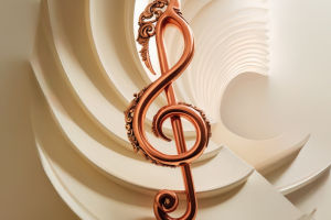
One of the best ways to create flow is by using curves, especially the "S curve" shape. This classic design tool guides the viewer's eyes in a smooth, serpentine path. You can use this shape in logos, page layouts, or even architecture to add a natural, flowing motion that feels effortless.
An example would be a landscape design, where a curved pathway leads your eye through the garden, helping create a sense of calm and movement.
2. White Space as a Flow Tool
It might sound counterintuitive, but white space—or the space around elements—is crucial for flow. When used strategically, white space gives the viewer room to breathe and helps guide their attention.
For example, instead of cramming a design with text, leaving some empty space around key elements helps draw attention to them, creating a clean, organized flow.
A minimalist website with ample white space helps users navigate quickly and efficiently, without feeling overwhelmed by content.
3. Z-Pattern and F-Pattern for Web Design
For websites, specific patterns, like the Z-pattern or F-pattern, are often used to guide a user's attention in a logical flow. The Z-pattern leads the viewer's eye in a zig-zag from left to right and top to bottom, while the F-pattern follows the natural motion of reading, guiding users across headlines, text, and images in an efficient order.
These patterns don't just make the design easier to follow—they also help enhance the user experience by ensuring the most important information is seen first.
Flow in Interior Design
Flow isn't limited to graphic and web design; it's also a vital concept in interior design. Here, flow refers to the way people move through a space and how the arrangement of furniture and décor feels natural.
1. Furniture Arrangement
In a living room, for example, the furniture should be arranged in a way that allows for easy movement. Chairs might be placed to encourage conversation, while leaving enough open space for natural pathways.
2. Color and Texture Flow
The colors and textures you choose also contribute to flow. By using soft, warm colors and smooth textures, you can create a relaxed, seamless feel in a room. On the other hand, contrasting textures and bold colors can create focal points that break up the flow but still add visual interest.
Flow and Emotional Impact
Beyond the technical aspects, flow in design is also about the emotional impact it creates. A design with good flow often feels more harmonious and balanced, helping to evoke a sense of calm or excitement depending on the intended mood.
1. Creating Calm
For spaces or designs meant to evoke calmness—like a spa or wellness website—the flow is gentle and smooth, with rounded shapes and soft gradients guiding the viewer through the design.
2. Creating Excitement
For something more dynamic, like a sports brand website or an action movie poster, the flow can be sharp and angular, leading the eye from one thrilling point to the next. This kind of flow creates excitement and keeps the viewer engaged.
Final Thoughts on Creating Flow
Mastering the art of flow in design is about understanding how elements move together. Whether you're designing a website, a product, or even an interior space, thinking about how people will navigate through and experience the design is key.
By using lines, contrasts, repetition, and even patterns, you can create a design that doesn't just look good, but feels good to interact with.
Remember, flow is about making your designs feel connected, intuitive, and natural. So the next time you're working on a project, take a moment to think about how the elements can move together in harmony, guiding the viewer in an engaging, smooth experience.


