Have you ever noticed how certain flower colors instantly change the mood of a room? Color is a powerful element in flower art, capable of evoking deep emotions and creating unique atmospheres.
In this article, we will explore how different colors in floral design affect our feelings and perceptions, and how artists use these hues to communicate subtle messages and moods.
The Psychology of Color in Floral Design
Color psychology is the study of how colors influence human behavior and emotions. When it comes to flowers, colors can send strong visual signals that impact how we feel.
For example, red flowers often symbolize passion, energy, and excitement. They catch the eye and convey strong emotions such as love or courage. On the other hand, blue flowers are calming and peaceful, invoking feelings of tranquility and relaxation.
Understanding the emotional responses to colors helps floral artists select combinations that match the desired mood of a space or event. This skill makes flower arrangements not only visually beautiful but emotionally resonant.
Warm Colors: Energy and Passion
Warm colors like red, orange, and yellow are associated with warmth, enthusiasm, and vitality. Red is the classic color of romance and intensity. Orange, a blend of red and yellow, represents creativity and joy, while yellow is linked to happiness and optimism.
In flower art, these colors are often used to brighten spaces, celebrate joyful occasions, or energize an environment. For instance, a bouquet with sunflowers and marigolds can uplift spirits and add warmth to any setting.
However, too much intensity from warm colors can overwhelm, so balance is key. Designers often combine warm hues with cooler tones or green foliage to maintain harmony.
Cool Colors: Calm and Reflection
Cool colors such as blue, purple, and green evoke calmness, introspection, and renewal. Blue flowers, like delphiniums or hydrangeas, can create a soothing atmosphere, ideal for relaxation areas or contemplative events.
Purple has a mysterious and regal quality, often associated with creativity and spirituality. Green, the color of nature, symbolizes growth and harmony. Floral arrangements rich in green foliage offer a fresh, peaceful vibe.
Cool colors are frequently chosen for ceremonies requiring calm and balance, such as memorials or quiet celebrations.
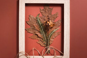
Neutral and Pastel Colors: Softness and Elegance
Neutrals like white, cream, and soft pastels add grace and subtlety to flower art. White flowers symbolize purity and simplicity, creating an elegant and clean aesthetic.
Pastel colors—soft pinks, lavenders, and pale blues—convey gentleness and tenderness. These shades are popular in weddings and baby showers, where a delicate mood is desired.
Floral designers use these colors to soften arrangements and create gentle transitions between more vibrant hues.
Combining Colors for Mood and Meaning
The interplay of colors in a floral design amplifies emotional impact. Complementary colors (those opposite on the color wheel) like purple and yellow, or red and green, create vibrant contrast and energy.
Analogous colors (those next to each other on the wheel) such as blue and purple produce harmony and calmness. Choosing the right combination depends on the message and mood the artist wishes to convey.
For example, pairing red and white can symbolize unity and balance, while a mix of orange and pink can evoke warmth and affection.
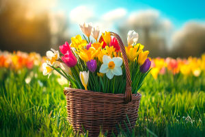
Seasonal Colors and Their Emotional Effects
Seasons naturally influence the color palettes of floral art. Spring flowers tend to feature fresh, bright pastels, symbolizing renewal and hope. Summer arrangements are often bold and colorful, conveying energy and celebration. Autumn colors—deep oranges, reds, and browns—bring a cozy, reflective mood.
Winter floral art favors whites, blues, and greens to suggest peace and clarity.
Artists harness these seasonal palettes to align floral designs with natural cycles and the emotional tone of each time of year.
The Impact of Color in Event and Space Design
Flower colors can transform environments beyond aesthetics. For events, color choices affect guest experience and atmosphere. For instance, vibrant reds and yellows energize social gatherings, while soft blues and whites create a calm, intimate setting.
In interior design, flower colors complement or contrast with décor to influence mood and perception of space. A minimalist room may gain warmth from a bright floral centerpiece, while a colorful room might use neutral flowers to balance vibrancy.
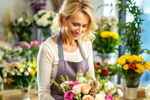
Floral artists collaborate with event planners and designers to ensure color harmony with the overall vision.
Conclusion: The Language of Color in Flowers
Color in flower art is a universal language that speaks to our emotions and senses. Whether you want to evoke excitement, calmness, or elegance, understanding color's impact empowers you to create meaningful and mood-rich floral designs.
Next time you see a bouquet or arrangement, pause and consider how the colors make you feel. What emotions do they stir? How does the combination influence your mood or the space?
I'd love to hear about your experiences with floral colors—have certain hues changed how you felt in a space or event? Share your stories or questions, and let's celebrate the vibrant connection between color and emotion in flower art!